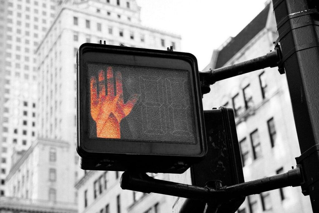
For your website, images are everything: they draw the attention and trigger a reaction in our mind instantaneously. If you use correctly the images, they play a key role in determining the first impression of a user, but they could also tell us what the website is about, and be a key factor to improve the positive perception of our brand. However, a wrong use of them could affect the user experience. So, how to make the correct selection?
CHOOSE IMAGES ACCORDING TO THE WEB DESIGN, NOT THE OPPOSITE

Even if all the aspects of your website are important (content, colors, font, information architecture etc. etc.), images need your full attention from the user experience point of view. Thinking, creating a choosing the photos for your website should be done also using the mind and critical eye of a web designer. For impact, position and consistency, images must be in harmony with all the components of your project.
TREAT IMAGES AS REAL CONTENT

You certainly agree with the fact that, on a website, an image is part of its content… but, do you really treat it as such? Do you use it as decoration or filler? Have you considered all aspects related to that content? Have you evaluated them correctly whether to use it or not? Have you considered the needs of your users and the impact that the photo will have on them? Does the image provide meaningful information or enhance the user experience? These are just some of the questions you should ask yourself before choosing an image for your website. Photos should not be used just to “beautify”. It is to make mistakes, so let’s better understand how to evaluate a photo before using it.
HOW TO CHOOSE THE PERFECT IMAGE

There are various aspects to consider when you choose a photo for your website. Let’s image that you know already how to evaluate the fundamental aspects of a photo: resolution, size, composition, and exposure. Once this is done, the image has passed the main test and you’ll be able to continue exploring the other fundamental aspects for its usage. Our brains process images 60,000 times faster than text, so it’s important to ask yourself some questions before making a choice:
IS IT USEFUL?
First of all, a photo needs to be useful. Using a photo to brighten up a page or fill in some space is not a crime, but even in these cases, it is necessary to consider the context in which they are placed. For photos to be appealing, stimulating, and useful, they should:
- help us understand something better
- teach us how to do something
- show us what something looks like
IS IT EFFICIENT?
Effective image is the one that prompts action, influences behaviour, and clearly communicates our message. For example, an effective product photo should not only make the product look beautiful, but convince users to purchase it. Every time an image is able to trigger a reaction in users, we can define it as effective.
DOES IT HAVE AN EMOTIONAL COMPONENT?
A photo with emotional component, should lead an emotional response from the viewer. Whether it is simply pleasant to look at, “shocking” to push us making an action, funny or attractive, the important is that the photo makes an impression on our subconscious, triggering a greater impact than a beautiful but totally “flat” image from an emotional point of view.
THE POWER OF FACES

There are 7 emotions:
- happiness
- sadness
- disgust
- fear
- contempt
- surprise
- anger
These are universal emotions and are communicated (partially) through the facial expression and physical gestures. If you are using photos of people to communicate your message, pay attention to these seven basic emotions and decide which ones you’re trying to convey. Even a small expression can make the difference. When we see a face, in fact, we are automatically drawn to it and unconsciously seek to empathize with the person we see.
HOW NOT TO USE PHOTOS IN WEB DESIGN

Although we have extensively discussed how to use images correctly in web design, it is also important to understand how they are ofter used improperly. Here are some examples of how NOT to use photos and which elements to avoid:
NOT COHERENT IMAGES
An image on a website should always be coherent with what the website is saying. If we consider a winery’s website, for example, this doesn’t mean that every single photo should feature grapes or wine, but rather that each image should reflect the textual content of the page it is on, creating coherence in the message and even reinforcing it.
IMAGES WITH BLURRED BACKGROUND
If used just as decorative “filler”, they don’t communicate anything about you or your website, or what you do. They are practically meaningless. Avoid blurry photo as much as possible… you can definitely do better.
STOCK IMAGES
Stock images rarely communicate the right message. They are images created specifically to represent a certain subject or situation. We are not advising you to completely avoid their usage (sometimes can be useful), but to not overuse and to invest in quality images by relying on a professional as well.
CONSIDERATIONS
Whenever you want to create a new site or web page start thinking about images at the beginning of the design process. If you’ve done the right research, choosing them won’t be difficult. Invest in photo shoots: A good photographer can exponentially increase the business value of your website.
Do you want some new photos to put on your website or for social media? Contact us now, we collaborate with some of the best photographers in the area!


