
Web Design trends of 2019
Keeping up with trends in the field of Web Design is essential for the success of your website. Over the course of 12 months, crucial changes can occur and a website that today appears elegant and modern, may seem dated and commonplace in just a few months. That’s why it’s important to ensure that the design of your website looks wonderful even after several years.
In 2019, the focus will be on user experience, giving priority to speed and mobile devices, presenting simple design with asymmetric layouts and immersive videos as backgrounds.
Speed

Let’s understand together why there is so much attention on users. How long do you think it takes to make a good impression on a potential customer? Well, if we are talking about online interactions, you have less than 3 seconds.
A recent study has shown that 50% of users expect a site to load in 2 seconds and will abandon the session if it takes more than 3 seconds.
We tend to be naturally impatient and fickle, and as beautiful a site could be, if the design is too “data-heavy”, you could lose views.
In addition to this, with the activation of Google Speed Update in July 2018, Google began prioritizing sites that require less loading time than others, and most likely other search engines will follow this direction.
So, what does speed have to do with web-design? Simple: since sites must be loaded faster, web design must also prioritize speed during the design process.
Flat Design
Clean and minimalist designs are characterised by their fast loading and are currently in vogue. You’ll definitely want to incorporate them into your site for two reasons: first, to improve the user experience of browsing your site, both for mobile and desktop users. Secondly, they can achieve high SEO values. This doesn’t mean that everything is reduced to two dimensions. On the contrary, it is all focused on minimalism and image usability. It is an aesthetic that focuses on the important parts of your site, using bright, clean colours and sharp edges. Moreover, the fact that an image is minimalist doesn’t necessarily mean that it is boring. Contrasts between very different colours and illustrations with simple images will become essential to ensure an attractive and engaging experience.
Mobile First
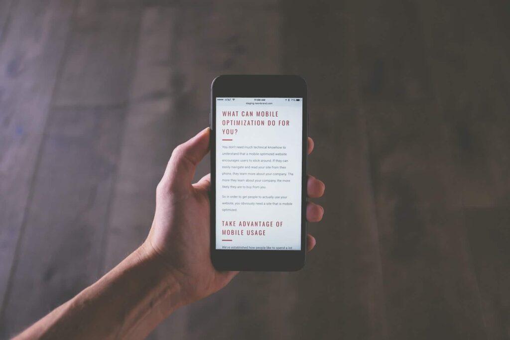
In 2015, mobile searches overtook those made on desktop, making mobile search the most used in the world. That being said, it’s no surprise that “Mobile First Design” is one of the trends of 2019.
In the past, a website was primarily developed for desktop or laptop computer and only later was a mobile-friendly design integrated. The Mobile first design implies that the process is exactly the opposite: the website is first created in a mobile version and only then is the version intended for desktop users implemented.
This web design trend meets the increasingly high demand of users operating with mobile devices and will likely remain so for a long time.
Broken Grid/Asymmetrical layout
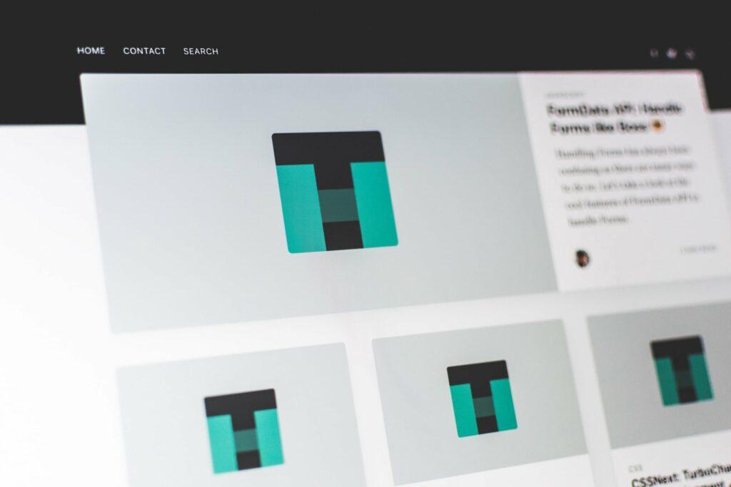
Broken grids and asymmetrical designs have made their mark in the web design industry. Although some web designers are pushing for increasingly simple, minimalist, and fast designs, there is also a contingent of designers that can’t resist the fresh and flashy look of broken layouts.
A grid system allows you to easily maintain alignment and consistency when adding new elements to any tool you are using.
In the past, not using a grid gave the appearance of sloppy work. However, the asymmetrical design and broken grids have gained more and more ground as a solution to stand out from most other sites while still maintaining a clean and attractive look.
Shapes
A trend that falls halfway between the minimalist of flat design and the controlled chaos of broken layouts is definitely the trend of geometric shapes. If you think that this refers to simple Eclidean geometric shapes you studied in middle school like triangles, hexagons, and circles, you are on the right track!
Geometric shapes can bridge the gap between flat and broken layouts thanks to their ease of integration into any design. Simple, colourful geometric shapes can create interesting margins with few simple gestures. Designs are composed of shapes with photos and text or can be used repetitively to create dynamic and deep patterns.
The versatility of this design element surely is one of the main reasons why it became a trend in 2019.
Geometric shapes are like colours, each of them can be associated with thoughts and emotions. Rectangles represent stability, circles represent unity, and triangles and diamonds are dynamic. The creative use of particular shapes or even the combination of different shapes can be used to shape the emotions or feelings you want to convey to your visitors.
Video Backgrounds
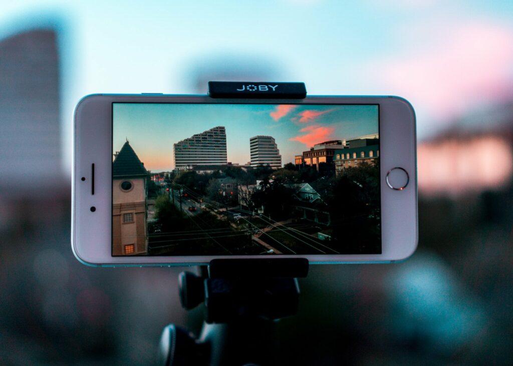
Despite the minimalism, quick-loading and flat design trend, video backgrounds are still incredibly popular and are part of the trends of 2019.
The reason for this is that videos are simply more engaging than an image or a text will ever be. You’ve probably seen this trend appearing on social platform like Facebook over the years. Posts containing videos are prioritized over other types of posts. They have even made it easier to watch videos with auto-play muted when scrolling the feed. When a user lands on your website and there is a video in the background, it is very likely that they’ll stay to watch it because videos capture the attention. This increases your time on the site metric, and the higher the time spent on your site, the better your SEO.
The power of a video is something that is impossible to explain in words: it delivers your message clearly and quickly, something that could take paragraphs of text. The video does it in a matter of seconds. This is particularly useful when you need to explain a complex message to your users in the limited time frame you have their attention.
Therefore, as far as the video is short, muted and of high quality, it can do a lot for your brand.
Chatbots

In recent years, interact and communicate with bots has become increasingly normal. Bots and chatbots are becoming common across sites throughout the digital world.
They start appearing here and there about 20 years ago, and it seemed like they made problem-solving even more difficult than it already as, but over the years these tools have become increasingly intelligent thanks to the improvement of artificial intelligence (AI) and machine learning.
Thanks to them, Google creates auto suggestions when you start typing in the search bar. They are also the reason why Facebook knows us so well, as they have helped it recognize our appearance and ask if we want to be tagged in a photo. They also use location data and they have learned our reading habits, so they know exactly which ads, events, information to show us in order to receive a “like”.
In 2019, this technology will continue to be refined and incorporated into business websites. Soon, web interactions will become even smoother. Imagine a site that always knows exactly what its customer wants simply by analyzing their previous interaction with the company.
Web customer service is becoming faster and more efficient every day thanks to these new technologies.
Final considerations
In conclusion, on the one hand, there are the visual delights of grid-based layouts and video backgrounds. On the other hand, there are the beautiful but practical principles of flat design and single-page layouts. As trends change, so does the industry.
Staying on top of these trends will help you keep your website fresh and beautiful.


